Redesign, Revealed
Last year, Apple announced macOS 11 “Big Sur” — featuring an all-new look and feel, with refreshed UI elements and icons. It’s the most significant update to the platform since OS X Yosemite. And once again, Apple continues to bring the Mac’s design language even closer to iOS.
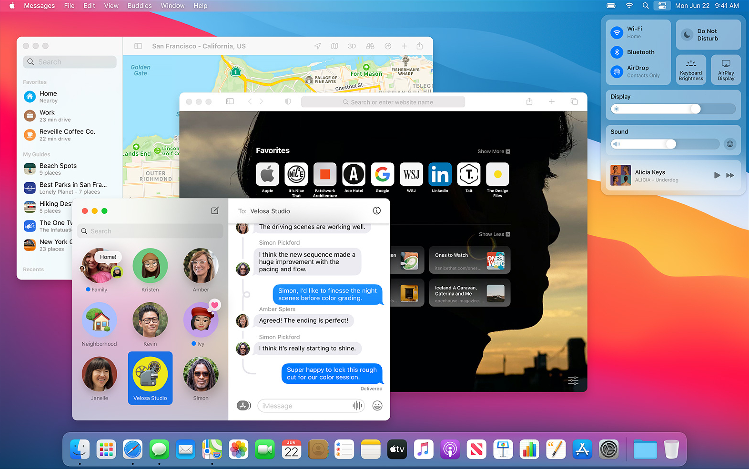
So what’s new? A lot. Everything’s been updated, from the app icons down to the controls. The refreshed look sports more minimal, “unified” toolbars, more vibrancy and blur effects, SF Symbols, plus an overall more friendly and rounded look. System apps like Mail, Messages, Maps (and even Xcode) have also been updated to be in line with the new design patterns.
It’s a big refresh, and makes the Mac feel even more modern and refined. Big Sur — and as of this year, macOS Monterey — sets up a whole new era of design for Mac apps. And consequently, sets up a whole new chapter for Reveal.
Interface-Off
The new UI changes in macOS are many, and they add up. Apps still work the same, and adopting the new look could be as simple as updating icons, buttons and controls. But to make an app appear like it truly belongs requires a lot of re-thinking and re-work.
In order to bring Reveal into this new era of design for the Mac, we decided to completely redesign it.
The Outline
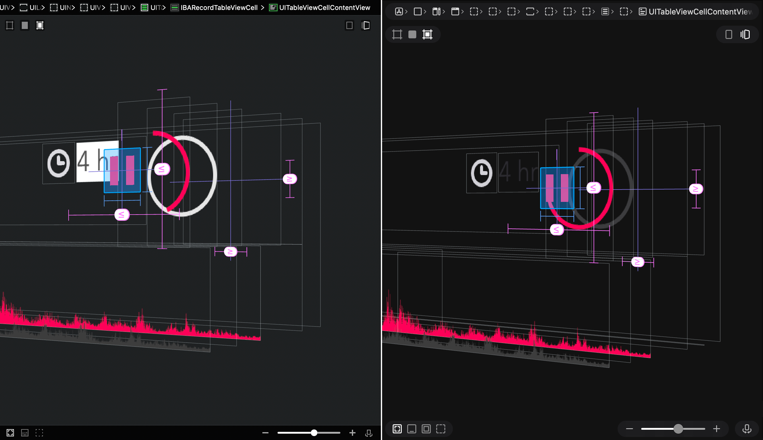
We started with the Outline sidebar. Reveal’s Outline shows a beautiful, legible list of an app’s views. It’s easy to scan, highlights views as you hover over them in the Canvas, and it’s buttery-smooth to scroll through. It has a bespoke and unrivalled design, and is one of Reveal’s most valued and powerful features.
The challenge we faced was trying to reconcile macOS’ newer, yet more sparse (and sometimes, illegible) vibrant sidebar, with our own. Given this was the direction the Mac was headed, we decided to adopt as much of it as we could, while tweaking it to keep our original design intent.
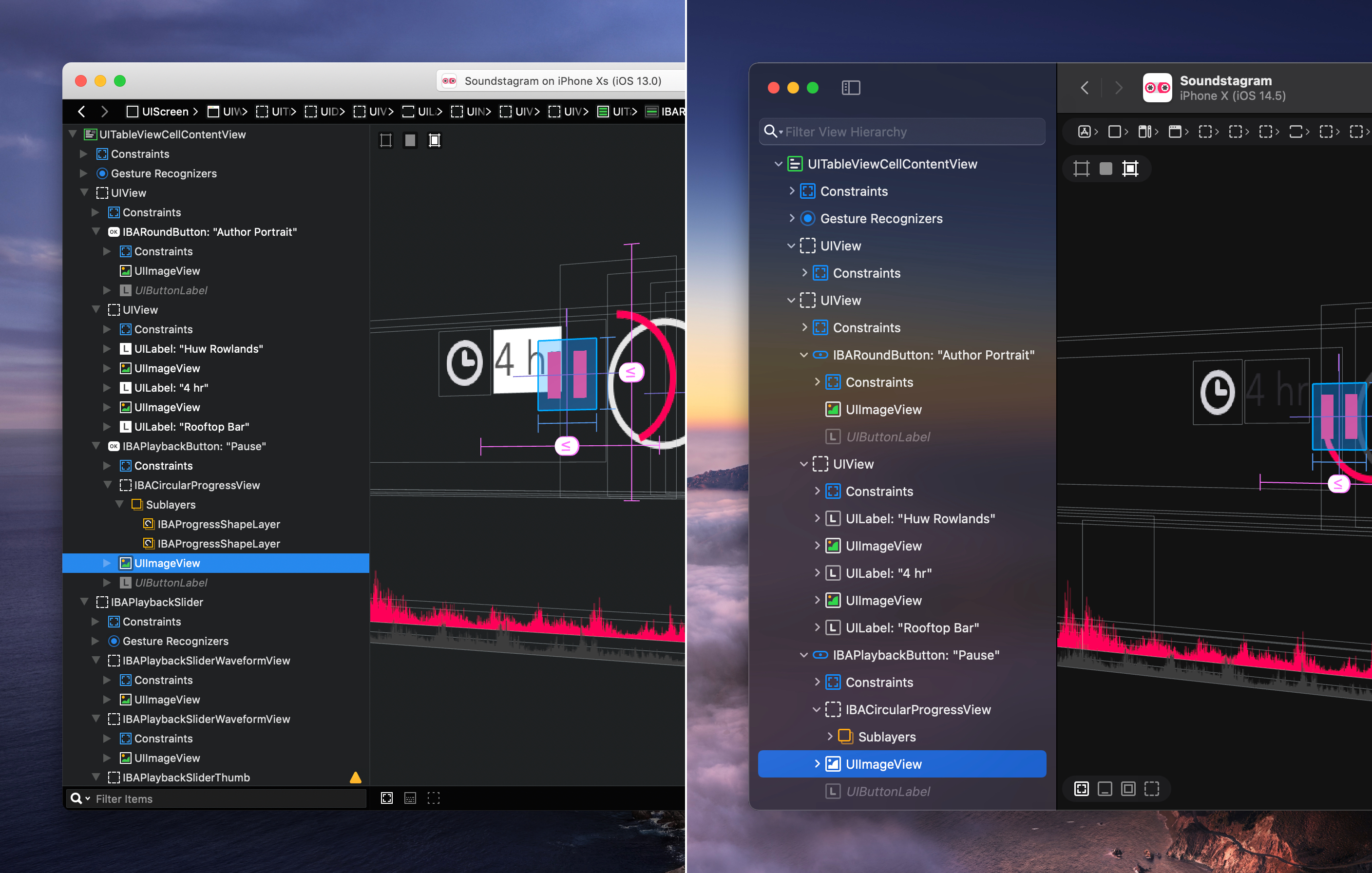
We ended up with a whole new Outline that’s been completely re-engineered, aimed at keeping the utility and performance of the previous design — while making it feel like it fits right in.
The Toolbar
Up next was the toolbar. Reveal’s toolbar provides information about the current app, and is the primary way to navigate between connections. Because of the updated, more prominent sidebar, our original design had to be overhauled to take advantage of the new layout. We used this as an opportunity to re-think the way it worked and to come up with a totally new design.
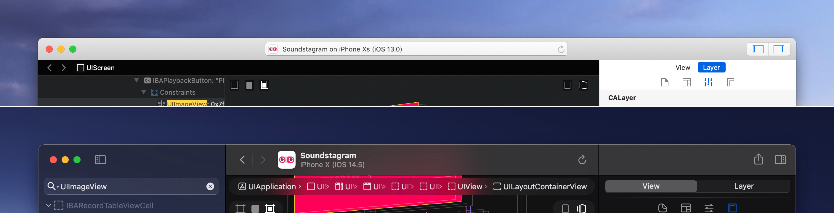
To redesign the toolbar, we took the minimal intent of the new macOS toolbar style and applied it to our own. Connection details now recede into the toolbar itself, allowing a more generous app icon preview. And the main navigation controls have been moved up, to a more convenient and prominent location in the toolbar.
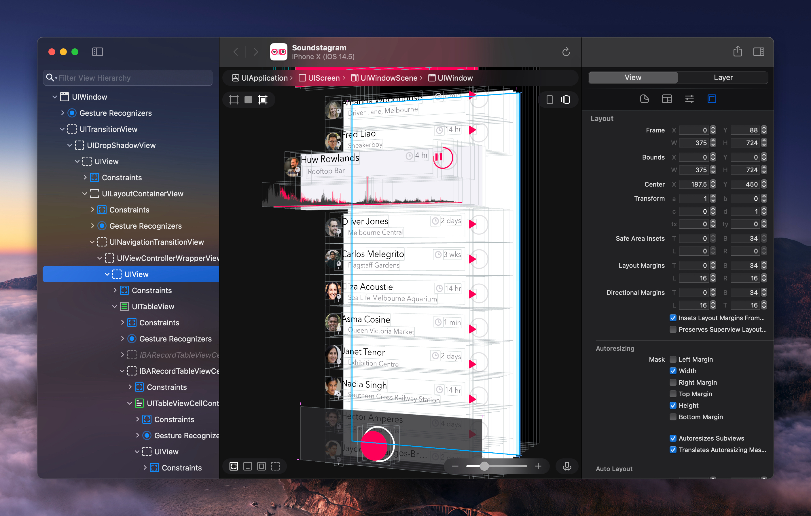
The Canvas
The interactive 3D canvas is the centrepiece of Reveal — it’s gorgeous, powerful and iconic — and something we didn’t want to change too much. Therefore, the only updates we made involved increasing the sizes and legibility of the controls. The scope bar is now centre-aligned, and with the rest of the controls, floats over the canvas using a subtle background blur.
The Icons
Apple’s SF Symbols now permeate the rest of macOS, and give buttons a bolder and more rounded look and feel. And since they all inherit from the same set, toolbar icons across apps have a consistent appearance and visual meaning.
Although the set offered by Apple is extensive, there aren’t enough of them to convey the many kinds of UIViews and elements that Reveal can expose. On top of this, SF Symbols aren’t pixel-hinted and we didn’t want a set of blurry icons in an otherwise sharp interface. As a result, we decided to re-draw all of Reveal’s in-app iconography.
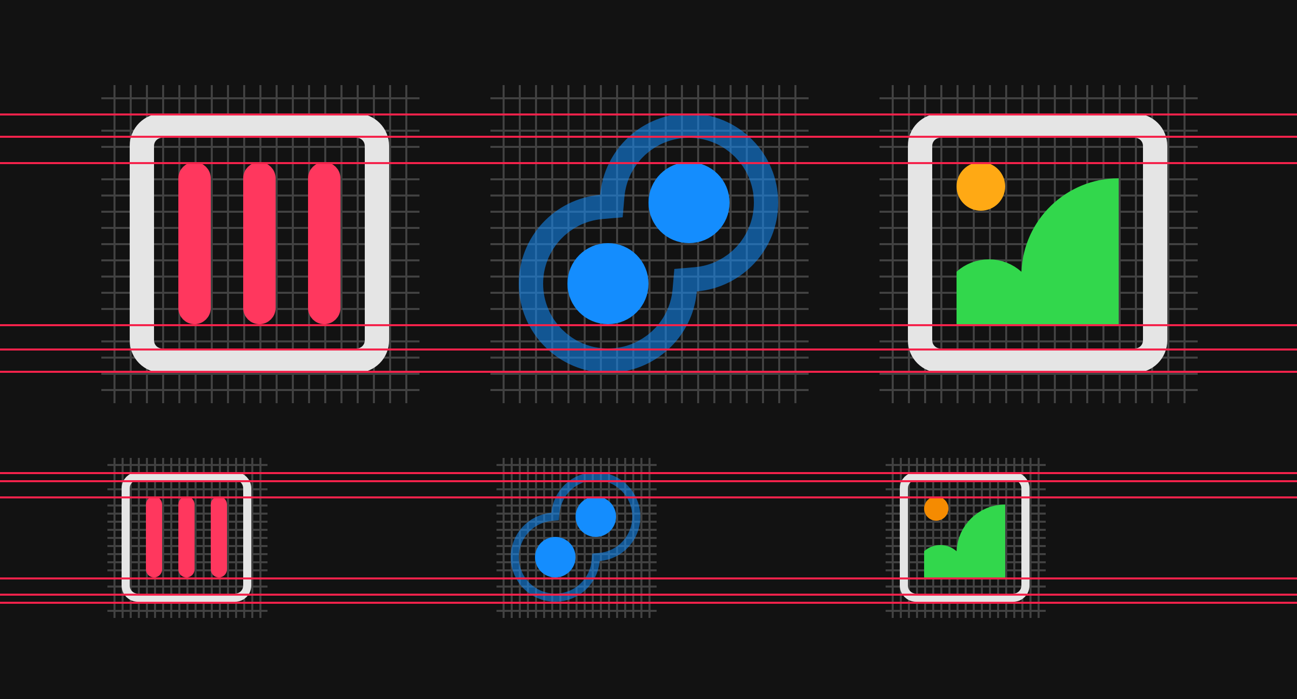
Every detail has been carefully considered, from keeping the original visual meaning of each glyph, down to the alignment of the 1.5pt strokes for @2x screens, and 1pt strokes for @1x screens. Even the alpha values have been set in a way such that similar-looking icons are distinguishable enough even if viewed without colour.
The Connections Dialog
Another updated design pattern in macOS is its new take on modality. App-Modal Dialogs have been established as the Mac’s convention to prompt opening, saving or selecting documents. And now, rather than opening as sheets that unfurl under an app’s toolbar, App-Modal Dialogs are presented as a more elegant window, detached from the app.
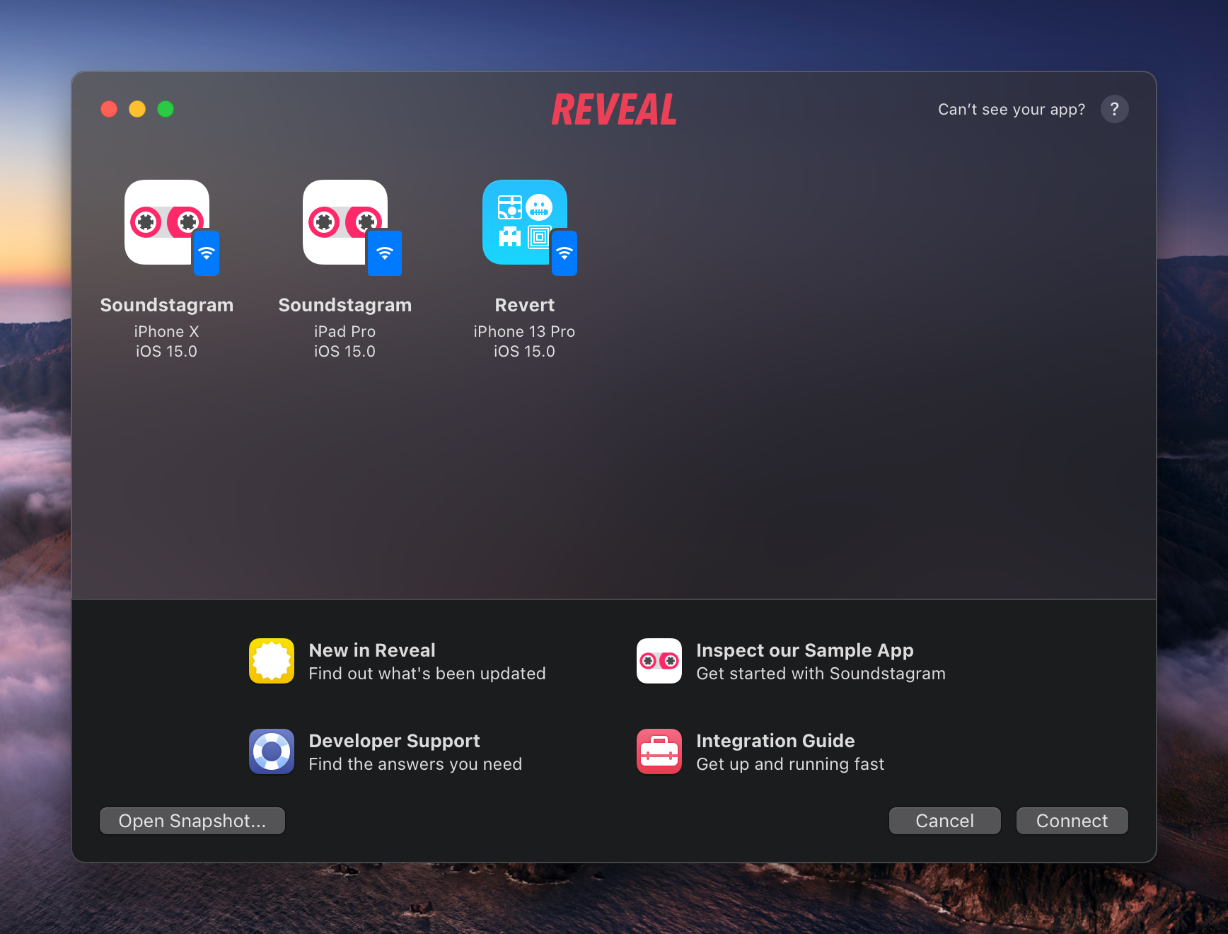
Given a lot of the restructuring we’ve made to Reveal’s layout, to keep it aligned with the new conventions in macOS, it made sense for us to do the same with Connections. The Connections “Sheet” and “Welcome Screen” have been combined into one, simpler modal dialog with a refreshed look and feel.
More UI Updates
While there was a lot that we did change to adopt the new look of macOS, the Inspector was the only thing we decided to leave untouched— for now. Reveal’s Inspector still stands the test of time, but we’ve got a lot planned for it in the future.
We’re continuing to shift away from our custom UI towards adopting more system controls and conventions — and it’s been paying off. With this new redesign, we’re leaning in to that even more, to take advantage of everything macOS can offer. This means that we can spend less time fixing and maintaining customised controls and focus on delivering features.
On the whole, Reveal’s UI has been completely redesigned and re-engineered for this next era of design on the Mac. This is one of the biggest changes we’ve made to the interface since version two, and sets up the foundation for Reveal’s future.
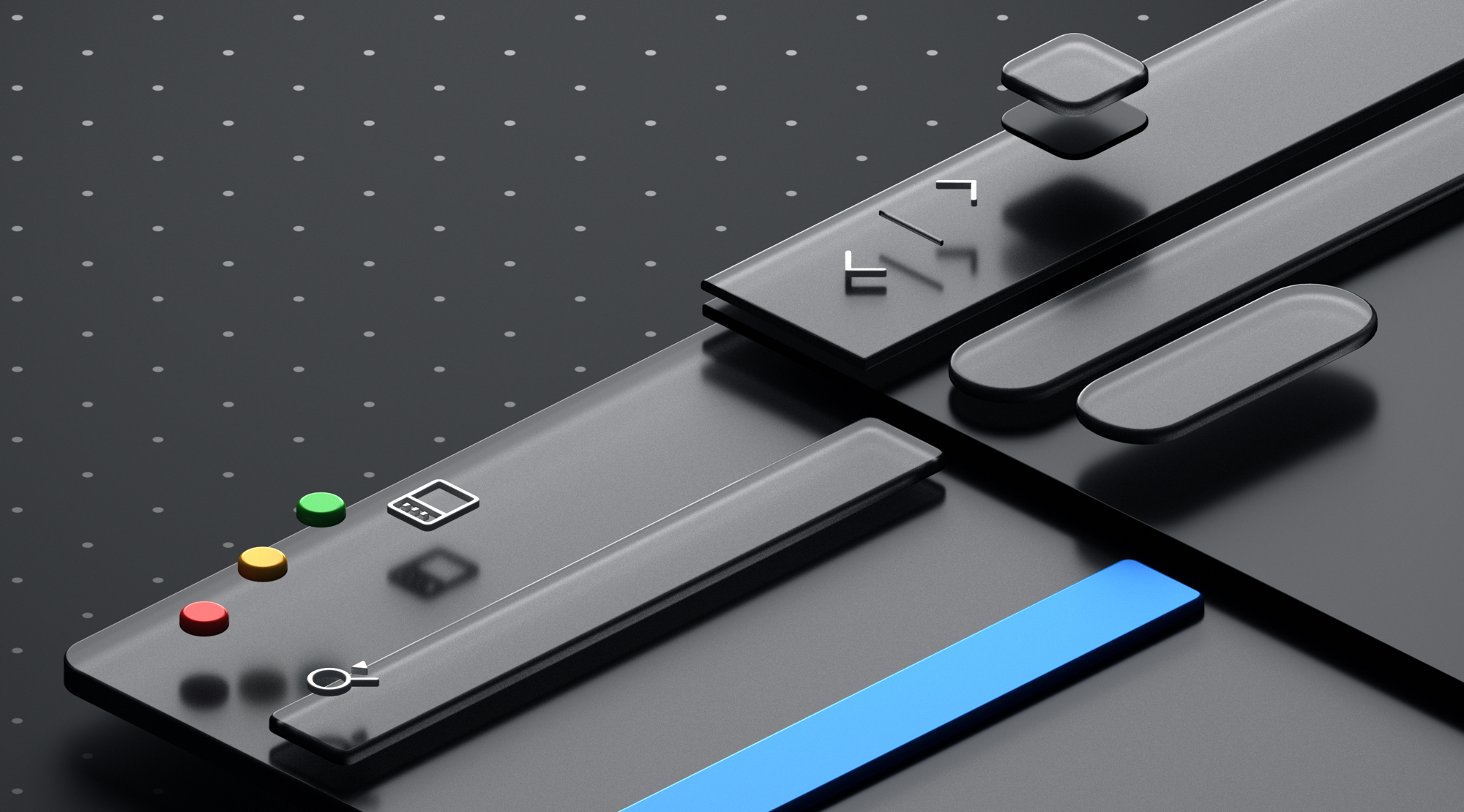
Thinking Outside the App Icon Box
A redesigned app isn’t complete without a new icon to go along with it.
As a part of the Big Sur release, Apple announced a new suite of app icons for the Mac. The new set is now more consistent with iOS, and takes on its rounded, “squircle” icon shape. The only distinction they’ve made to — “make it more Mac” — is an added layer of depth and dimension using gorgeous 3D-rendered objects that can extend beyond the edges of the base.
![]()
Conforming to this new style posed a hefty challenge for us with Reveal. Our iconic chatterbox had a unique silhouette, and it stood out against other icons on the dock. Shrinking it down to fit within the base wouldn’t have just diluted the impact of our icon, but seemed like an easy way out. And so, much like our revamped interface, we used this opportunity to explore a new design.
Explorations
What is Reveal? How do we distill such an abstract concept into a simple illustration? Should we start from scratch, and throw away a much-beloved and recognised logo? — These were the questions we discussed over and over, deep within many threads across the whole Itty Bitty Apps team.
![]()
We explored a few directions and tried to resurrect older ideas — but in the end, decided to go all-in on the chatterbox. This meant that our next challenge was to figure out how to take our existing brand, and make it appear like it belongs next to Apple’s own apps. Eventually, the approach we landed on was to re-draw the chatterbox in 3D.
Modelling in 3D
Many hours were spent modelling an origami chatterbox in Blender. Although tedious upfront, modelling in 3D made it easier to compose the final scene. The chatterbox could be rotated and moved; the lighting could be adjusted; and the virtual camera’s settings could be set up on the fly. All it takes is a bit of set up, the push of a button, then a few minutes of rendering, until we get a couple of potential variations of the chatterbox in 3D.
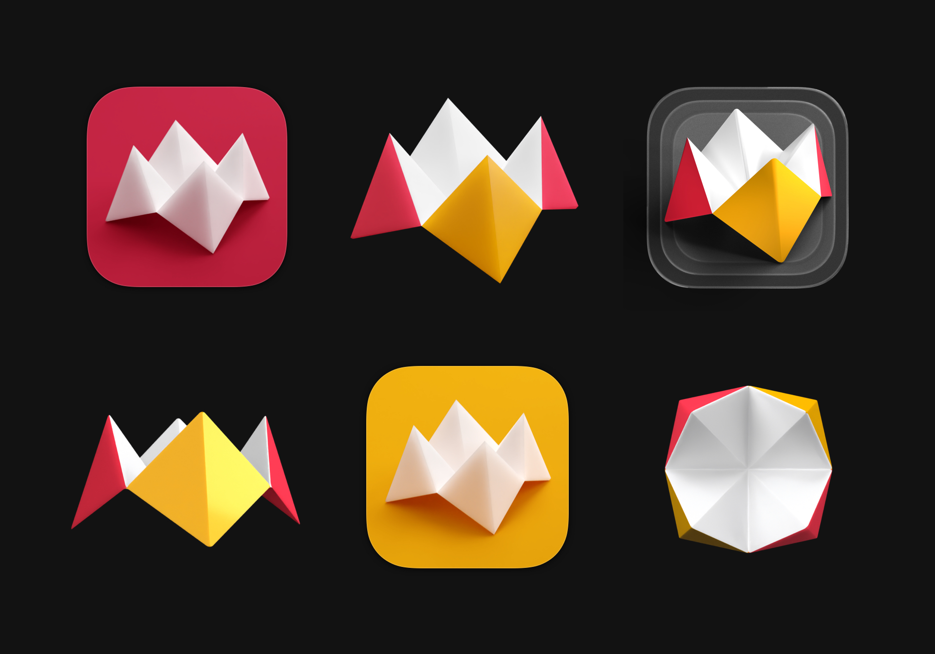
Once the model was set up, it then came down to the styling. The lighting was set to give the chatterbox its recognisable shadows and sharp lines. Within the scene, the chatterbox was then placed on a platform to bounce the light and provide a subtle reflection under the model. And finally, the textures on the chatterbox were manually hand-painted with a digital, watercolour brush (our goal was to make it look like it came straight out of a Pixar film).
![]()
And above is the end result. Our iconic chatterbox, re-modelled and re-textured in 3D — while staying true to the iterations before it.
Reveal’s Next Chapter
It took a lot of re-thinking and re-engineering, but we’re really proud of where we landed with Reveal today. There’s a level of design, care, and attention to detail that people love about Reveal — and we hope to have met that with this new design.
But it doesn’t stop there. Although it’s going to be one of the biggest changes we’ll make to the app in a while, we’ll keep evolving, growing and refining Reveal over time. This major redesign sets up a whole new chapter for Reveal, and we’re very excited to show you what we’ve got lined up next.