Revealed: Soundproof
At NSConference 7 I was fortunate to meet Marc Palmer, an avid Reveal user and developer of Soundproof, a practice app for musicians. As I poured over the UI and we discussed the implementation, it became clear that this would be a great app to feature on Revealed.
Marc, can you tell me a little bit about yourself and Soundproof?
Marc: I’ve been a programmer since I was 11, so that’s around 31 years ago now. I left school at 16 because I hated it, and persuaded my dad to employee me at his small software company in the music industry. At that time I was in the UK Atari ST demo scene coding graphics in 68000 assembly. It was much more interesting than working on DOS and early Windows 3.1 apps, although I loved Turbo/Object Pascal. After some Borland C++ pain I moved to Java web apps, Java 2 ME embedded apps, Java mobile phone games and then fell back to web apps for big brands and a lot of Grails open source development.
When the iPhone SDK came out I started playing with it and studying this “alien" Objective-C stuff but didn’t make the switch to iOS commercially until 2013. That year I had been working on our first app with Adam in my spare time, which is still unreleased, but then had to have emergency spinal surgery to avoid becoming paralysed. This was one of those times that really focuses the mind, and I became resolved to convert to full time commercial iOS/Mac work as soon as possible. Two days after surgery I was hacking iOS at home in bed; the miracle of modern medicine.
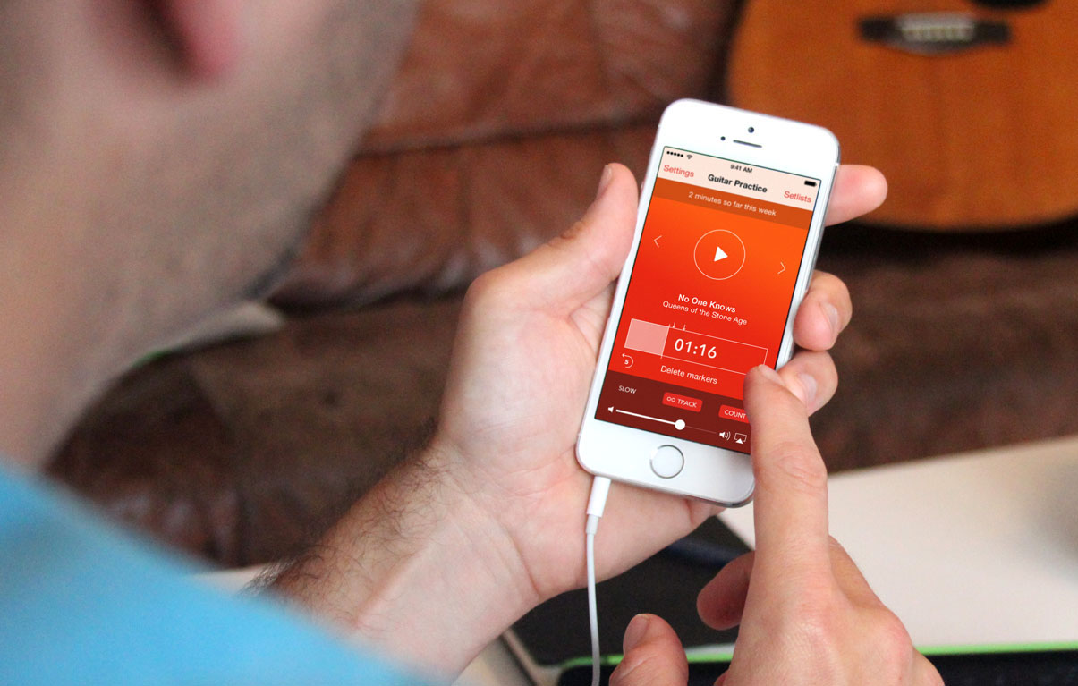
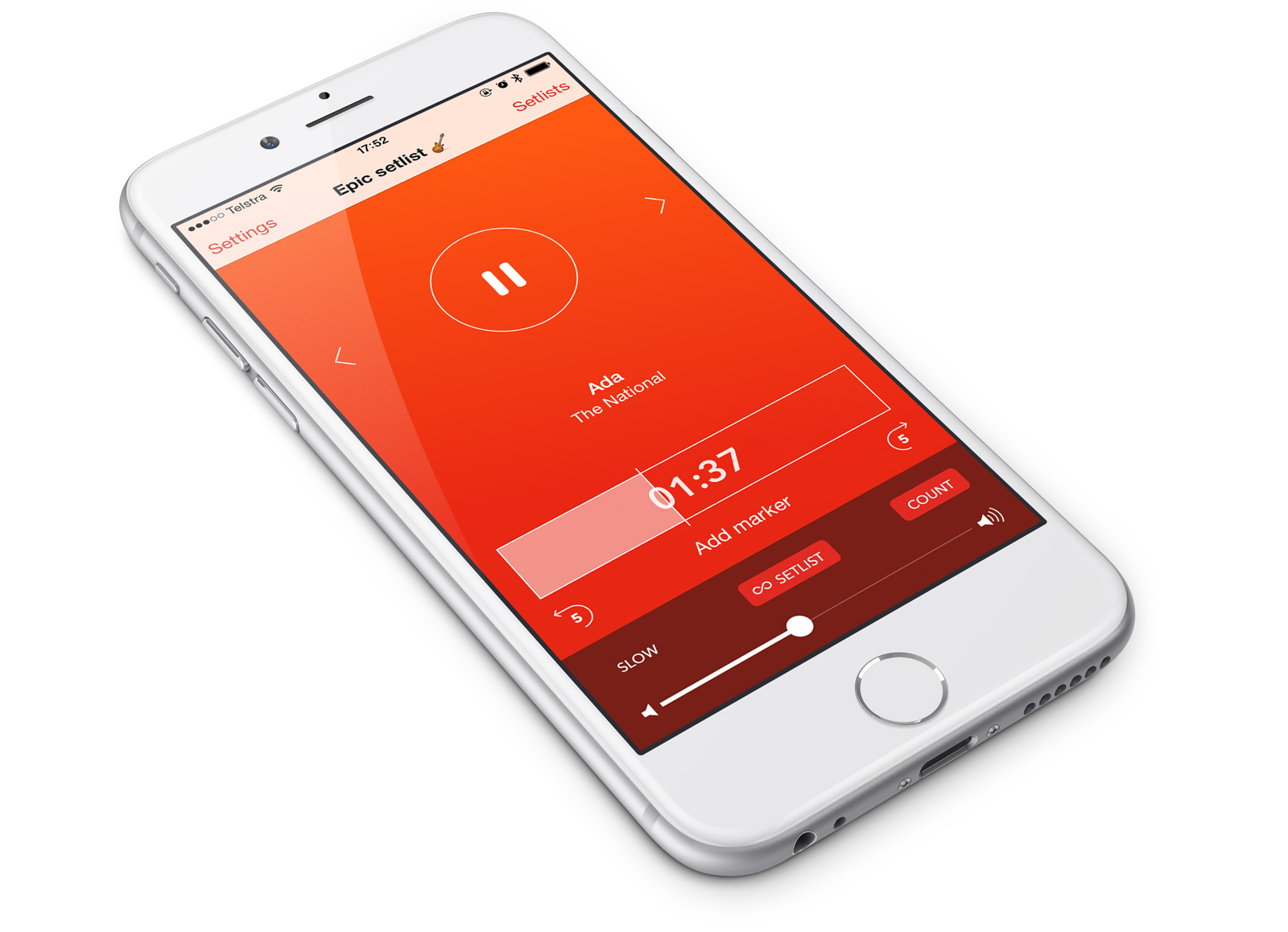
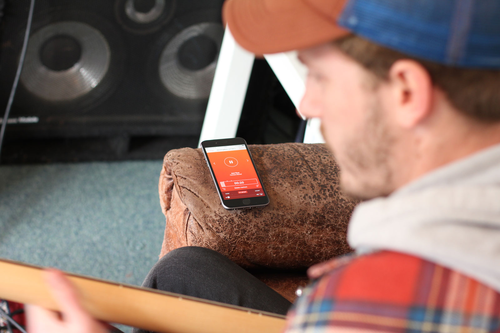
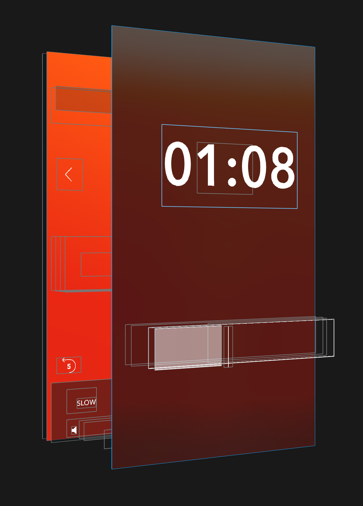
Soundproof was the first in-house app we built. To fill a need we had as musicians, it is all about effortlessly looping the music you practice. There is no “repeat off” mode. Swiping between tracks is infinite, the set list just cycles around. The controls are deliberately oversized and easy to hit at arm’s length. We wanted everyone to find it easier to practice using the app, not more fiddly, where you try to hit a little button while holding a plectrum, cello bow, or drumsticks. We also have a cool count-in and text-to-speech track announcements you can toggle without interrupting your flow.
Plus, we also needed to get an app in the store to prove ourselves commercially in the iOS contracting market. With one big unreleased app still in development we needed to get something in the App Store quickly and I foolishly thought Soundproof would be a quick 2-3 week project. It turned out that we are incapable of releasing something half-baked, so we iterated… and iterated…
Who is the app aimed at - what’s the target audience?
Marc: Soundproof is for anybody who needs to learn by playing, singing, or listening along with audio. Many of us practice by just playing along with tracks. This is who we want to reach. People who want to improve their skills and maybe need help to practice more by removing the friction. I play guitar but have been learning drums for some time. When I practice I put the phone in my pocket with a loop region set, headphones on and just jam along until I can’t any more. At the end, it tells me how much time I spent doing that practice, and how much I’ve done that week.
My daughters use it too. My 12 year old puts the phone on her music stand and plays along with pieces and recordings of scales, and my 9 year old props it on the music stand of a piano keyboard and taps out tunes while it loops a little tune she’s trying to learn.
How long have you been working on it, and how big is your team?

Marc: There are two of us at Montana Floss Co., Adam Hinks and myself. We spent about three months getting Soundproof to 1.0. The hardest part of building it was the time it took us to get a track selector, set list, and player UI structure that we were happy with. When you look at the built-in Music app for example, it is pretty much upside down for what you want when you practice. When you open the app, you always want to be in the player where you left off. We built, threw away and rebuilt that whole UI several times. Sometimes things can look great in wireframes but when you actually try to use it…
Did you work with a designer?
Marc: Oh yes. I wouldn’t work without a designer, and I was lucky enough to meet Adam, a great local brand and visual designer, a couple of years ago. We get on because we both like Metal music, are very fussy, and hanker for simplicity. I am pretty good at iterating on UX problems but I can’t even draw a square with a pencil. Plus I can display shockingly bad taste at times.
So Adam and I work together on all the UX and product design. It works really well, especially as we now run a small co-working space together here in the UK and get to help each other all the time.
Did you have any inspiration for the app?
Marc: Not so much direct inspiration from other music apps. I am a big fan of classic iOS apps like Tweetbot, Day One, and Writer.Pro — in terms of general polish and simplicity. I was a user of Capo on Mac long ago, and also used it a little on iOS for working out riffs.
We are so lucky to have great apps like Capo and AnyTune Pro for high quality slow-down and other fancy features, but Soundproof is all about the player mechanic and the specifics of repeat practicing rather than working out the minutiae of solos. It is a great complement to tools like that.
If anything the inspiration for Soundproof came more from the old 4-track recorders you could get when we were kids; with buttons to set and reset in/out loop points. We think of our iOS apps as tactile, almost mechanical devices. We want everything to make some kind of kinetic sense. We also don’t want an audio waveform display. We want people who are learning to use their ears more and get a feel for the structure of tracks. It is opinionated software.
The UI is very clean. It’s custom, but works well with the platform. Do you think iOS 7 & 8 have made it easier for developers to design for the platform?
Marc: Perhaps, but not for me. My design skills are so lacking — and I’m also very lazy about it. Get someone who knows what they are doing rather than labouring over it yourself. It has, on the other hand, made it easier (but not easy) to find good designers, as they don’t also have to have photo-realistic texturing skills. Adam is certainly very keen on the flat design, as he loves print. The iOS 7 & 8 styling is much closer to what he likes.
What was the most complicated UI element in the app to build?
Marc: There were a couple of tricky things actually. The zooming time display and the time position slider were pretty hard to make. As an example, the slider morphs to expand the loop region full width when you enter loop mode. As ever with good iOS apps, there’s a lot of detail that isn’t immediately noticeable, and this is the stuff that takes time.
When did you find Reveal useful and how did you use it?
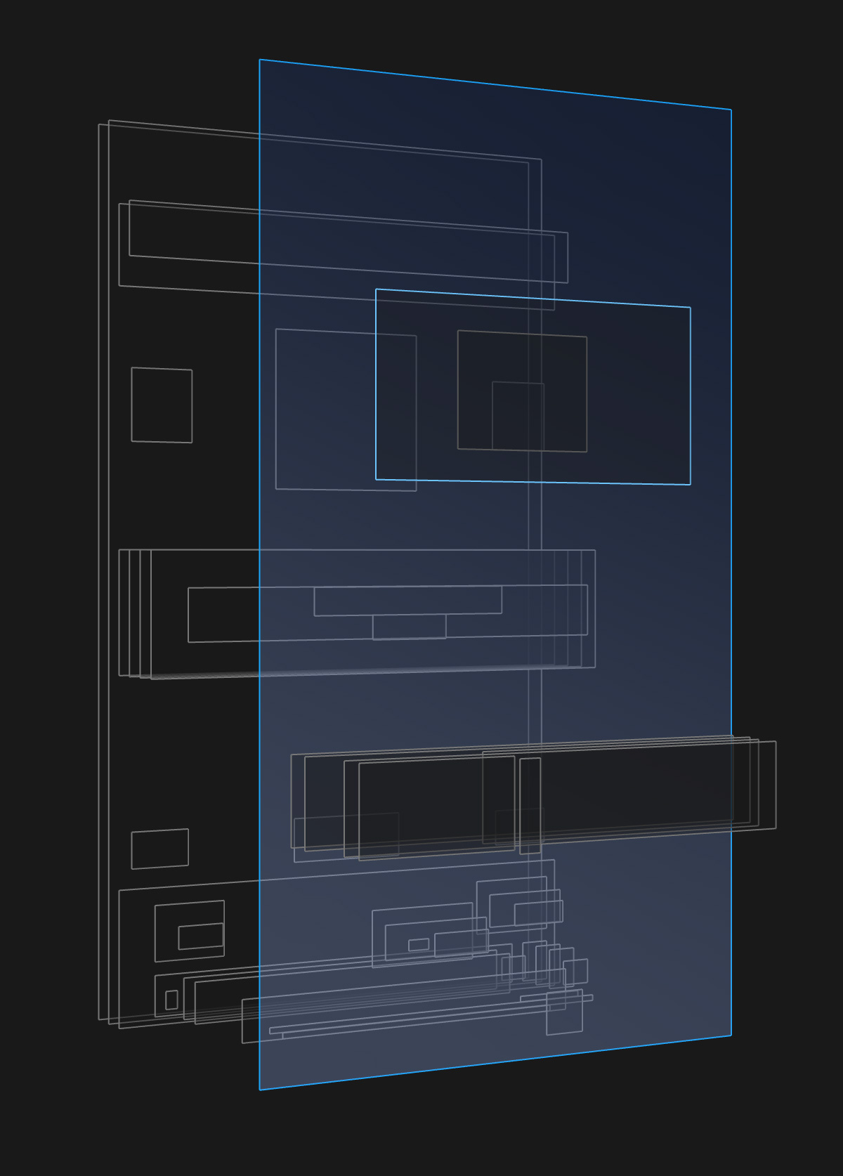
Marc: I started using Reveal back in 2013 when I was working on that first app we still haven’t released yet. In Soundproof I used it to solve the classic “where the hell is my view” problem, as well as the tricky controls like the time slider which involve multi-layered sub-controls that cross fade and change bounds to create the transition effect. Also the volume control and its handling of the AirPlay button appearing and disappearing when external outputs become available — frankly all of it. The drop-down stats bar in the app was also fiddly, as you’ll know if you’ve done something similar, so being able to see its positioning and verify its bounds for clipping was invaluable.
Oh, and our infinitely swipeable track selector is a UICollectionView with some trickery to add false items at each end of the scroll range. Viewing what items were offscreen in that case in Reveal was great. We’re 100% Auto Layout and oh how we wish we’d had that in Reveal when we did the app!
We also used it a lot to tweak colours, sizes and positions, and to debug retina stroke pixel alignment issues in realtime. Modifying properties on the fly and seeing the results immediately on the device was so useful. We tweaked until it was right and then I wrote the values down and carried them over to the source. Things like getting the pixel alignment of custom background images on a UISlider were very challenging because of some weird undocumented iOS behaviours and insets. Without Reveal it would have been almost impossible to identify these.
I like how when you tap the scrubber the time zooms up and the rest of the UI fades away. Can you describe how you achieved that?
Marc: I’m glad you like it. I’ll try to explain it the best I can. It took so much tuning, you wouldn’t believe. The user experience we wanted here was based on the fact that while you are scrubbing the track at arm’s length with an instrument in your other hand, no other controls matter. There are a few things going on at once with it. The time display label has to move up the screen from its position on the time slider to where the Play button is, getting much larger as it does so. At the same time we fade in a full screen dark blurred image view that sits on top of everything but the time label and the slider in the Z-order, so the slider and time appear to “push through” the blur. It’s a nice bit of sleight-of-hand. This was developed pre-UIVisualEffectView.
The tricky part is that if you use a scale transform to zoom a UILabel you’ll get pixellated text, which obviously won’t do. So when you start dragging the slider we instantly swap the font on the UILabel for the much bigger font we use in the final top position, and we counteract the change in size by applying an appropriate scale transform to the label, to shrink it to the same size as the original small font. There’s a slight pixel discrepancy here in the text rendering but you don’t notice it, its so fast.
Anyway, with the pixellation solved, we can zoom from the shrunken large version of the font up to an identity scale transform in the final position where the Play button normally is (yes, we are animating constraints). When you release the slider, we reverse most of this — we keep the big font until it drops down to the lower position in the slider, and then swap the font and scale transform back out to the originals. If you look closely you can sometimes see this change happen at the end — we should put a crossfade on that! Of course we are applying some spring velocity to the movement of the label too but only the tiniest amount. Adam and I fiddle for ages with that stuff as we never want it to be obvious, but you do want it to be at least noticeable in terms of feel.
Funnily enough after we launched Soundproof we noticed that the Soundcloud app added a similar time animation when scrubbing, but without zooming the text or fading out the rest of the UI. We didn’t copy it — and of course like ours more. It has the Jony Ive-ish “fiddle factor” which we intentionally build into everything we do.
What’s next for Soundproof?
Marc: We have a 1.1 already in the pipeline with some nice feature additions, including more ways to get audio into the app, i.e. not just from the Music Library. We’ve also got more slow down options, which has been a frequent request from users. We’re not a slow-downer like Capo or AnyTune and never will be, but we can add more Soundproof-style options. Also, Watch support is coming…
We have big plans beyond this of course, but… “Montana Floss Co. does not discuss future products” :)