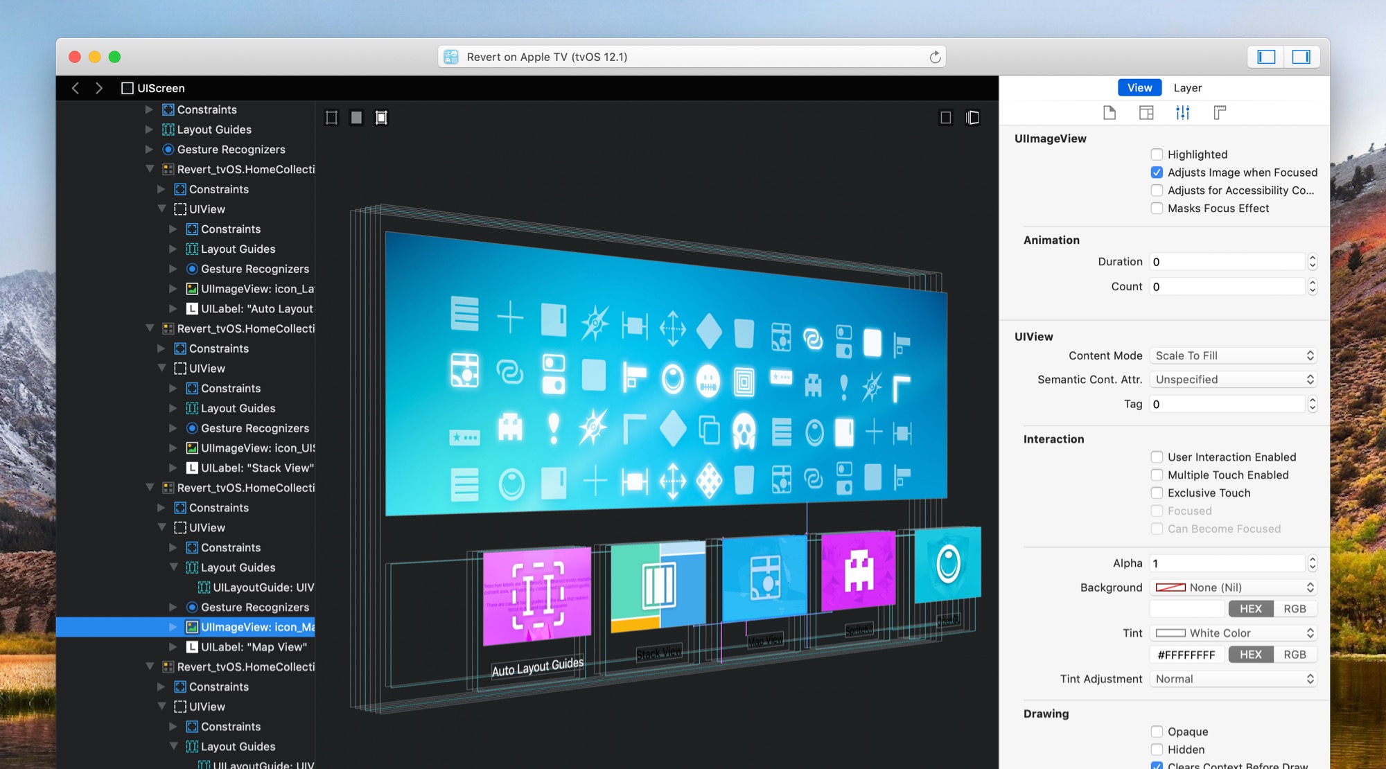
Taking Revert to tvOS
To make sure we take support for tvOS on Reveal even further, we recently updated Revert, adding compatibility with this new Apple platform.
As explained on the Reveal.app blog, Revert is an open source project that comprises a series of common and edge case scenarios that help us optimize Reveal and ensure its quality with every update, making sure there are no regressions being introduced.
Coming from the iOS and macOS worlds, here’s what we learned from working with tvOS:
Focus Engine
This is probably the most noticeable change when starting tvOS development. Interface elements aren’t meant to be pointed at with a mouse or touched with your fingers, but are instead focused on a TV across the room according to movements on a touch surface on the Siri Remote.
Focusing a view brings it forward, making it more prominent. Only a single object can be focused at a time. Previously, the only focusable objects were views, but support for this has been extended to non-view items on tvOS 10.
So just like you would use the arrow keys on your computer keyboard to move selection between different files or folders, you now bring a button into focus on your TV and make it the frontmost element. In both cases, you know that that’s the item you will be interacting with when proceeding with the default selection action — be it a key press or a tap on the Siri Remote.
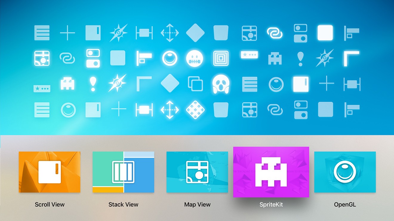
Yes, please do check out the SpriteKit example!
When using most of the controls available on tvOS you get that behavior for free, since they come with sensible defaults that make the focus engine change their appearance automatically. But that is not the same when using standard UICollectionViewCells.
So, let’s say you are a very attentive iOS developer and noticed most of the apps on the TV have UIs that resemble collection views. That seems like a good starting point, right? Thus, you quickly set up a project with a simple collection view and default cells to start playing with the OS and nothing gets focused.
It turns out that is the expected behavior, since collection view cells are composed of ordinary views. You need to use the collection view delegate to update the look of each cell when adding or removing focus. Or, as an easy way around that, design your cells using UIImageViews. By default, they will animate their images in and out of focus when placed as subviews of focusable elements.
If you’d like to get more technical details about the focus engine and what is possible, the Airbnb developers have some great material here.
Sideways, not Downwards/Upwards
Michael Flarup said it best on Designing for the Apple TV: the natural interaction on tvOS is moving the selection around elements — as opposed to smartphone touch screens where entire views get scrolled.
When more content needs to come up or down as a result of a vertical gesture, the whole interface might need to get redrawn, which means the user could potentially get disoriented for a moment while trying to get acquainted with the changes on the screen. Horizontal gestures, on the other hand, usually require redrawing just the related elements that sit side by side.
Based on that approach, we built Revert based on a split view with categories on the master view and test scenarios on the detail view. Scrolling up and down on the list to the left refreshes all the entries to the right — but browsing a single category to the right does not change anything else on the screen. Additionally we need to test tvOS split views with Reveal.
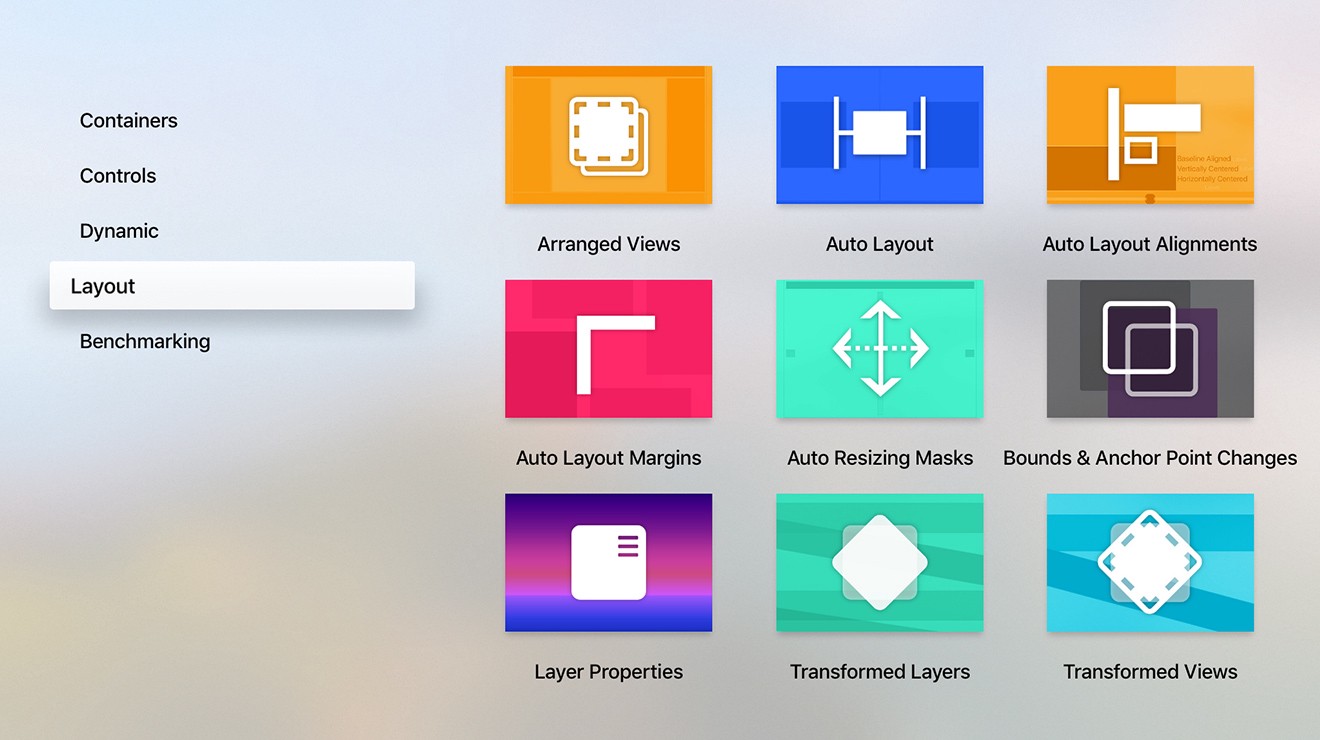
Vertical scrolling on the master view refreshes the whole detail view
Remote Coordinates System
The Siri Remote (as well as game controllers connected to the Apple TV) can handle touches in windowing mode or interpret their absolute values.
To read absolute touch points (where exactly the user touched on the touch surface) we need to use the GCMicroGamepad profile, signaling that the remote will be used as a game controller. Otherwise tvOS defaults to windowing mode, like what happens on the SpriteKit example in Revert.
When using windowing, initial touches on the Siri Remote are always considered the origin (0, 0). So it does not really matter if the gesture starts on the bottom left corner or on the top right corner of the touch surface on the remote. We just start reading finger movement from there.
Unlike on iOS, where the user directly manipulates the interface, on tvOS the user interacts with the Siri Remote — which is one level removed from the interface on screen. This means the user is likely not facing the interaction controls, and thus the concept of the initial touch being “flexible” and gestures starting from there becomes fundamental for building a good user experience.
Missing Controls and Frameworks
Everyone has been making quite a fuss about the absence of UIWebView (or WKWebView) and the Safari View Controller, but there’s more stuff from iOS that didn’t make it to tvOS, like UIToolbars, UIPickerViews, UISliders and UISteppers. MapKit was also absent at launch, but was subsequently included in tvOS 9.2 and is already a part of Revert — check it out to see where all of us here at Itty Bitty Apps come from.
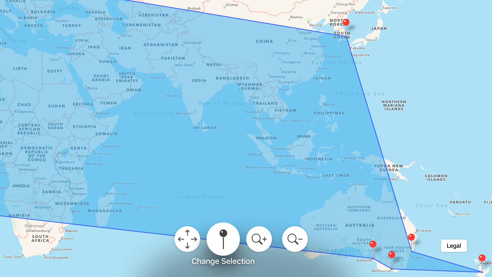
That’s us!
Many frameworks are not included in tvOS, although many of them do not make much sense anyway because the Apple TV lacks the hardware required.
So if you plan on porting an iOS app to tvOS, it is worth checking if all the components you require are either available or can be replicated in some fashion. As an example, Apple implements the language selector in the Settings app (a common use for pickers) as a UIAlertController with many options.
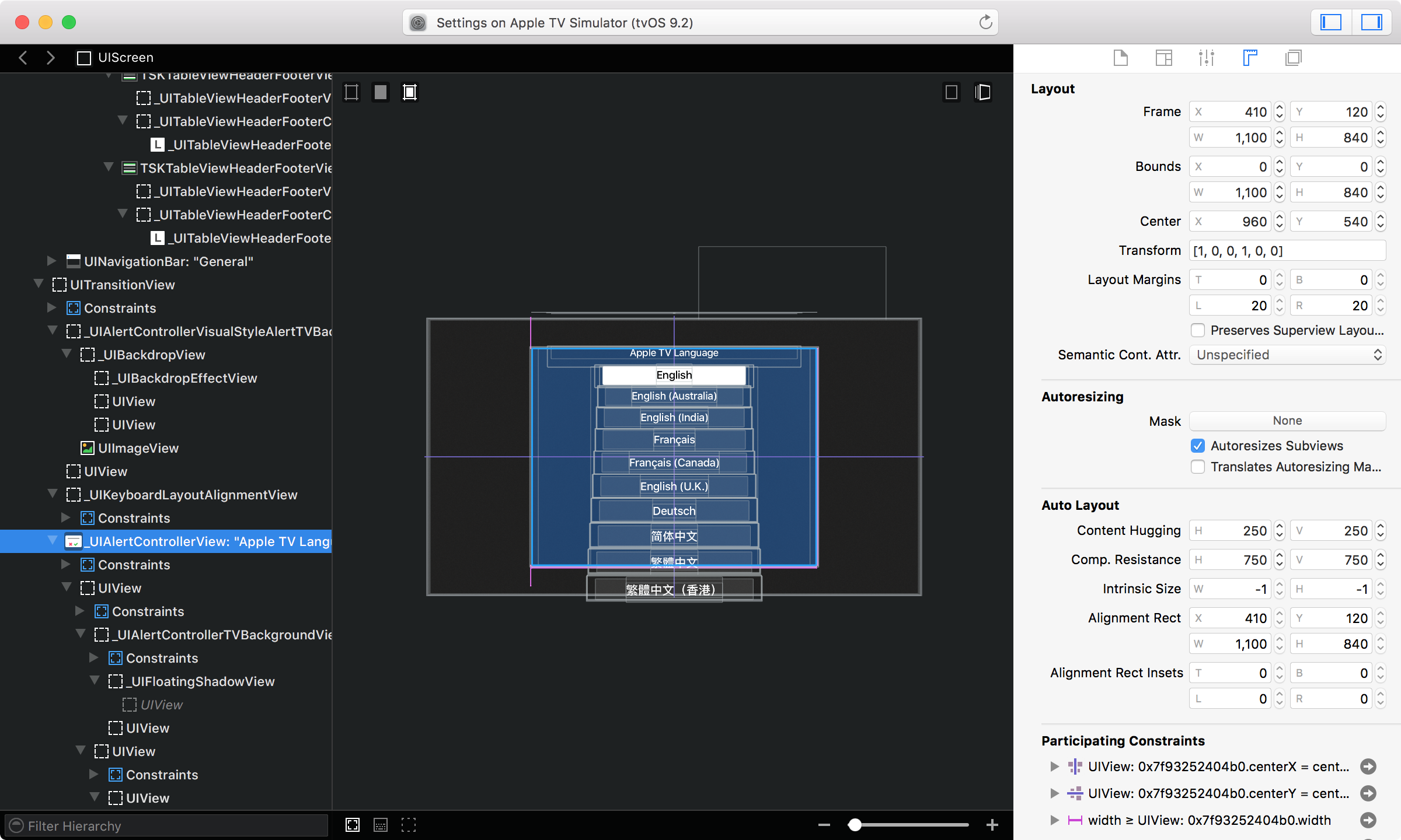
Language selector in tvOS 9.2 inspected on Reveal: UIAlertController with many, many options
Reuse Code, Not Storyboards
If you’re porting an iOS app to tvOS and have got at least a few non-trivial views, this is probably one of the biggest pain points in your endeavor. Storyboards are not interchangeable, and you can’t even copy and paste specific elements between the platforms.
After screaming, crying and flipping a few tables, it is hard not to agree at least in part with that decision though. Since not all the controls from iOS are available on tvOS, it makes sense to have storyboards specific to each platform.
Local Storage
Most people will say there is no local storage for a tvOS app, but that is not really the case. Here’s what Apple says about it:
(…) your app can only access 500 KB of persistent storage that is local to the device (using the NSUserDefaults class).
So there is local storage available, but it is limited to what can be done with the NSUserDefaults class. If your needs go beyond that, then saying there is no local storage is accurate.
And in that case, doing it online is the only way to go. Be it CloudKit or any other cloud service.
Binary Size
There’s also a limit on app binaries. They can’t go over 200 MB, which means using the on-demand resources API introduced on iOS 9 for anything that can’t get bundled in the app.
Since, as mentioned previously, there’s no local storage for anything other than NSUserDefaults, this also means you might need to keep fetching assets every time the app is run. Apple makes this clear:
The maximum size of an Apple TV app is limited to 200 MB. (…) all other data must be purgeable by the operating system when space is low.
Top Shelf
Apps placed on the top row on tvOS can take advantage of the top shelf — a TV Extensions Service that allows exposing contents of the app on the home screen.
Content presented on the top shelf is a combination of a static banner used as the background and dynamic items that can be interacted with by users. You have no control over where your app icon is placed on the user’s home screen, so every app has to be prepared for being placed on the top row:
At a minimum, every app must supply a single, static top shelf image that can be displayed when your app is in the top row of the Home screen and in focus.
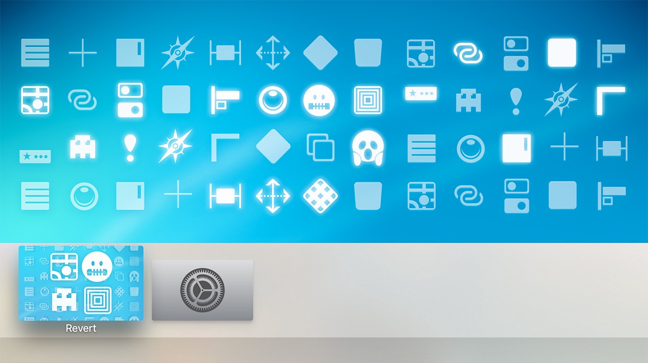
Top shelf is an effective way to bring attention to your app.
Overscan
Last, but definitely not least, there’s overscan. This can be a gigantic issue if not considered initially or, even worse, completely neglected.
Surprisingly, there hasn’t been much mention of overscan when people talk about tvOS. But the truth is, there should be. iOS and macOS developers are used to knowing where their apps are going to be run and how that hardware behaves. That simply isn’t the case with tvOS.
Although Apple TVs may work the same and only differ in storage capacity, there is no way of telling what kind of TVs will be displaying your app. Some may have overscan enabled, some may not. Some may allow disabling overscan, some may not. And having overscan enabled means you should not be using the whole screen estate do draw your app. Never place important content too close to the edges.
If you are coming from the game console world, it may be natural to consider the TV Safe Area when thinking about your visual design. But as iOS developers, we don’t expect our layout to be simply clipped at the edges of the display.
Different TVs have different levels of overscan — so testing your app in a few models might not be enough, and there’s currently no way for tvOS to query them for the amount of overscan being used. So the safest route you can go is using industry standards to account for that. Apple recommends placing your layout in a box that sits 90 pixels from side edges and 60 pixels from top and bottom edges.
So if we were only allowed to take one lesson from the whole project, this would probably be it: account for overscan, and do so right at the beginning. It won’t be fun gathering everyone around to show your fresh new app only to find out the aggressive overscan on the TV breaks your layout. It also won’t be fun refactoring a potentially massive storyboard, if you went with that option.
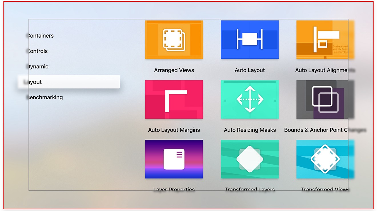
How Revert could look without thinking about overscan, ouch!
As mentioned in the beginning of this post, Revert helps us optimize and improve Reveal in every update. So if you are a Reveal user (thanks! 🎉) and find yourself with an example that doesn’t work quite right, please fork Revert on GitHub and submit us a pull request with your edge case so we can make Reveal even more useful to you in the future!
